Eight combinations, four of them shown
Eight shirt colours, eight sections. Four of them — looks five to eight — are shown in the images below, each one on a cream wide-leg trouser. The other four are written out shade by shade instead, and two of those, looks one and four, change the trouser on purpose.
The point is the shade, not the setting. Most advice on cream trousers shows eight men in eight rooms, which tells you nothing; every look here names the exact shade to buy and the near-miss shade to leave on the rail.
Written out: 1. Navy shirt · 2. Chocolate brown · 3. Pink shirt · 4. Cream shirt
The four renders on this page are AI-generated on a mannequin, not photographs of a model.
If you only buy three shirts
Own one good pair of cream wide-legs and buy in this order. Navy first — the only shade that works over cream and over white, day and evening, with no colour judgement required. Chocolate brown second — the one dark that adds warmth instead of contrast. Pink third — in a muted shade it is the colour most men skip, which is why it reads as a decision.
The five rules that never change
These hold across all eight. Everything after this section applies one of them.
- Keep the trouser cream, not stark white. Cream, ecru or bone softens the join at your waist. A cold white under a warm shirt cuts a hard horizontal there and the outfit reads as two separate pieces.
- Tuck it, because the waist is the proportion. A pleated high-rise wide leg is built around a visible waistline. Hide it and the trouser reads as baggy rather than deliberate. Untucked works only at hip-bone length.
- The shoe follows the shirt, not the trouser. A dark warm shirt wants black, because brown against brown muddies. A soft pale shirt wants white or tan; black is too heavy a stop under that much light colour.
- When shirt and trouser share a family, the gap between them is the outfit. Tonal pairings look either expensive or accidental, and the difference is one visible shade of separation. Check it in daylight before you buy.
- One accessory, and it brings no colour of its own. A steel watch or plain leather strap is enough. A coloured dial adds a third tone, and cream outfits already carry two.
All eight at a glance
The second column matters most: these pairings fail on shade, not colour, so the wrong version sits beside the right one.
| Look | Shade to buy — and to avoid | Trousers | Shoes | Day or evening | Who it flatters |
|---|---|---|---|---|---|
| 1. Navy shirt | Deep ink navy, matte. Not royal or electric blue. | Off-white or cream | White or tan | Both | All tones |
| 2. Chocolate brown shirt | Coffee-dark brown. Not tan or camel. | Cream | Black | Evening | Wheatish and deeper |
| 3. Pink shirt | Dusty rose, muted and warm. Not bubblegum or baby pink. | Cream | White or tan | Day | Wheatish and deeper |
| 4. Cream shirt | Warm ivory. Not a cool optic white. | Dark brown | Dark brown or black | Evening | All tones, fairer especially |
| 5. White shirt | Pure cool white. Not off-white or ivory. | Cream | Black, or white for the harder version | Day | All tones, deeper especially |
| 6. Black polo | True black, fine-gauge knit. Not washed black, not pique jersey. | Cream, warm end | White sneakers | Both | All tones |
| 7. Maroon striped shirt | Burgundy or oxblood with a cream stripe. Not cherry red, not a bright white stripe. | Cream | Black | Evening | Wheatish and deeper |
| 8. Yellow striped shirt | Butter or wheat with a fine white stripe. Not bright lemon. | Cream | White or tan | Day | Wheatish and deeper |
The eight combinations
1. Navy blue shirt with off-white wide-leg trousers
The combination in words: a deep ink navy shirt in matte cotton, over off-white or cream wide-leg trousers, with tan or white shoes.
Navy is the shirt to buy first because it is the only one here that does not care which pale trouser you own. Over cream it is quiet; over off-white it is crisp.
Navy is a cool dark. Rule one says a cold white under a warm shirt splits you at the waist — but navy is not a warm shirt, so the hard line between navy and white stops being a mismatch and becomes the point. It is why navy and white survives being worn to death.
Buy the deep ink end, and buy it matte. A royal or electric blue turns the outfit into sportswear, and any sheen in the weave catches light and reads cheap next to a flat cotton trouser. Full sleeves, rolled once if it is hot.
Shoes decide the temperature. Tan puts warmth back into an otherwise cool outfit; white keeps it cool to the floor and is sharper with the off-white trouser. Either is correct, which is not true of any other look here.
2. Chocolate brown shirt with cream trousers
The combination in words: a coffee-dark brown shirt over cream wide-leg trousers, with a black belt and black shoes.
Every other dark shirt here works by contrast. This one works by continuity. Chocolate and cream are the same colour at different strengths — cream is what brown becomes with almost all the pigment taken out — so the outfit steps down rather than cutting off.
That is the appeal and the risk. Step down too little and you lose the shirt against the trouser, which is why the brown must go genuinely dark: coffee, bitter chocolate, the colour of a strong filter brew. A tan or camel shirt lands too close to cream and the outfit goes flat.
Black at the belt and at the floor. Brown shoes under a brown shirt with a warm trouser between them is three warm browns fighting over the same ground. The black belt also works structurally: it cuts the vertical once, at the waist, stopping a low-contrast outfit reading as one long garment. A plain white or silver dial keeps the watch out of the colour conversation.
3. Pink shirt with cream trousers
The combination in words: a dusty rose shirt, tucked, over cream wide-leg trousers, with white or tan shoes.
A pink shirt is the one most Indian men own once, wear once and retire — and it is almost always the shade that was wrong rather than the colour.
Buy dusty rose. It is a muted pink with brown pulled through it, sold also as old rose or clay, and that brown is what makes it belong next to cream. Both are warm, both desaturated, so the pairing reads the way navy and grey reads: two members of one family, one darker. Leave the cool version on the rail. An icy or bubblegum pink is a cold pastel on a warm trouser, and that mismatch is what people remember as "pink didn't suit me".
Keep everything else silent. Plain cotton, no print, no contrast collar, buttons in the same tone. White or tan shoes; black is too hard a stop under a shade this soft. Tucked, always. It is a daylight outfit, and a good one for a function where every other man is in a white shirt.
4. Cream shirt with dark brown trousers
The combination in words: a warm ivory shirt over dark brown trousers, with belt and shoes in dark brown or black.
Turn look two over. The same two colours and the same warm step between them, but the dark mass now sits at the floor and the light one is up at your face.
It is the only one of the eight built this way, and it behaves differently enough to get its own section below. The shades are simple. The shirt should be a warm ivory, not a cool optic white — held against a white bedsheet it should read faintly yellow. The trouser should be a genuine dark brown, walnut or bitter chocolate, not a mid-tan landing too near the shirt.
Shoes in dark brown or black, both correct here, which is unusual. The trouser is already dark, so the shoe extends a mass rather than stopping one and either tone reads as continuation. Belt matching the shoe. This is the one look that goes up in formality rather than down: with a jacket over it, it is a wedding-reception outfit.
5. White shirt with cream trousers
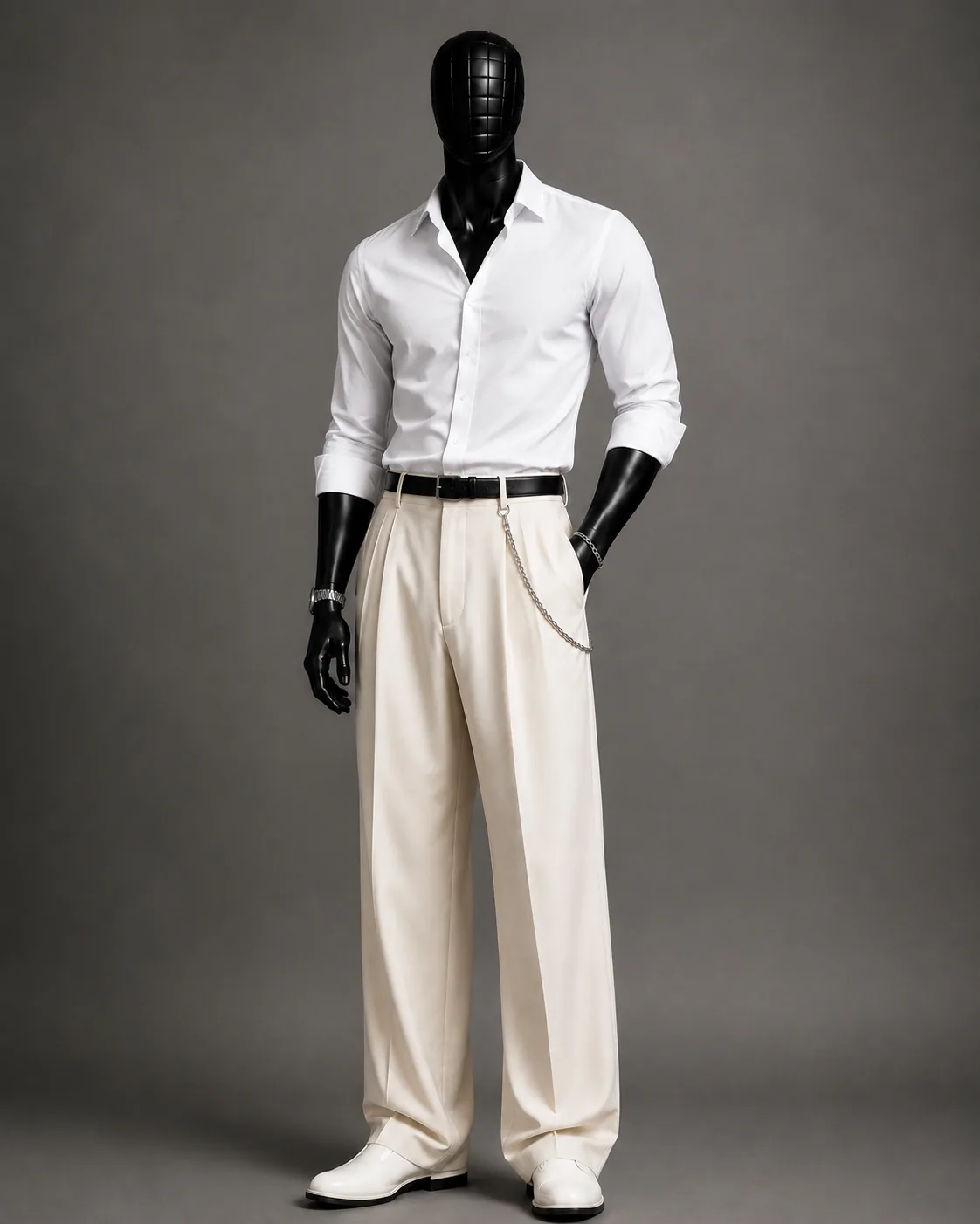
This is the hardest pairing on the page, not the easiest, and it fails more often than the rest. Two shades of one family means no contrast is doing the work for you — the outfit lives or dies on how far apart the two whites are.
Rule four is the whole job. Shirt: pure, cool white. Trouser: warm cream, ecru or bone, and the warmer the better, because warmth is what separates it from the shirt.
The belt is the other half of the argument. A dark belt cuts the vertical exactly once, at the waist, which stops the whole thing reading as a single garment. Without it, this can look like hospital scrubs.
Cotton, not linen. Linen is the obvious hot-weather choice, but it creases into shadows that blur the boundary between shirt and trouser, and blurring is what a tonal outfit cannot afford. The image shows white shoes, extending the pale line to the floor — clean, and unforgiving. Black is safer.
6. Black polo with cream trousers
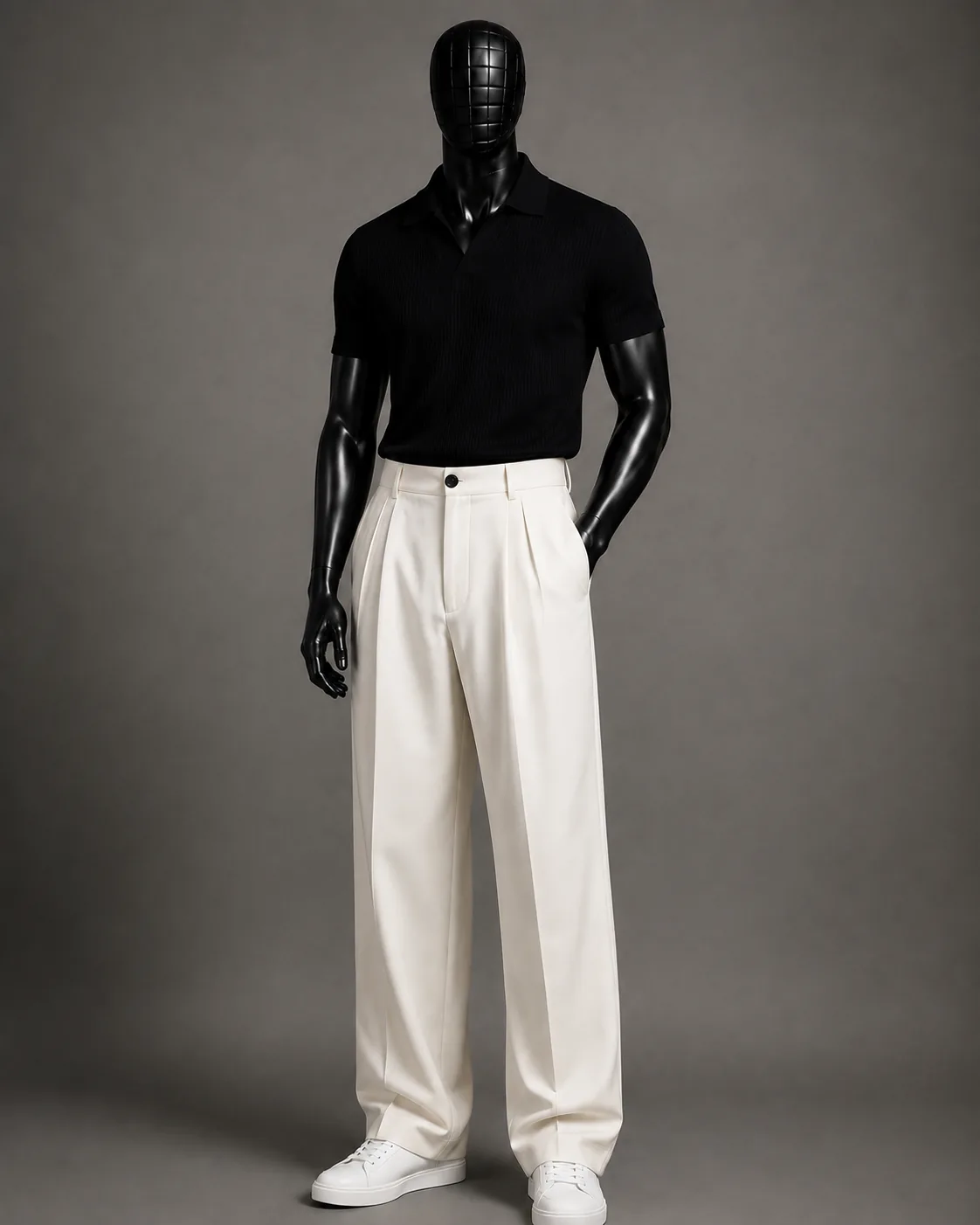
The highest contrast available here, and contrast is what makes an outfit look intentional from across a room. There is no colour judgement to get wrong — black goes with any bottom — so everything rests on two details.
The first is the knit, the single biggest variable on this page. A ribbed or fine-gauge knit polo has texture and drape; against a structured pleated trouser you get soft over sharp, the principle behind a jumper with tailored trousers. A pique polo — standard sports-shirt jersey — turns the identical outfit into a work uniform. It is that binary.
The second is the cream. Black is cool and absolute, so pull the trouser to the warmer end — bone or ecru rather than an icy off-white — or the pairing reads as a uniform rather than a choice. True black too, not charcoal or a washed black, because a faded black beside a crisp cream looks like a mistake.
Open collar, sleeves ending mid-bicep and sitting close. White sneakers: the softness of a knit asks for a soft shoe.
7. Maroon striped shirt with cream trousers
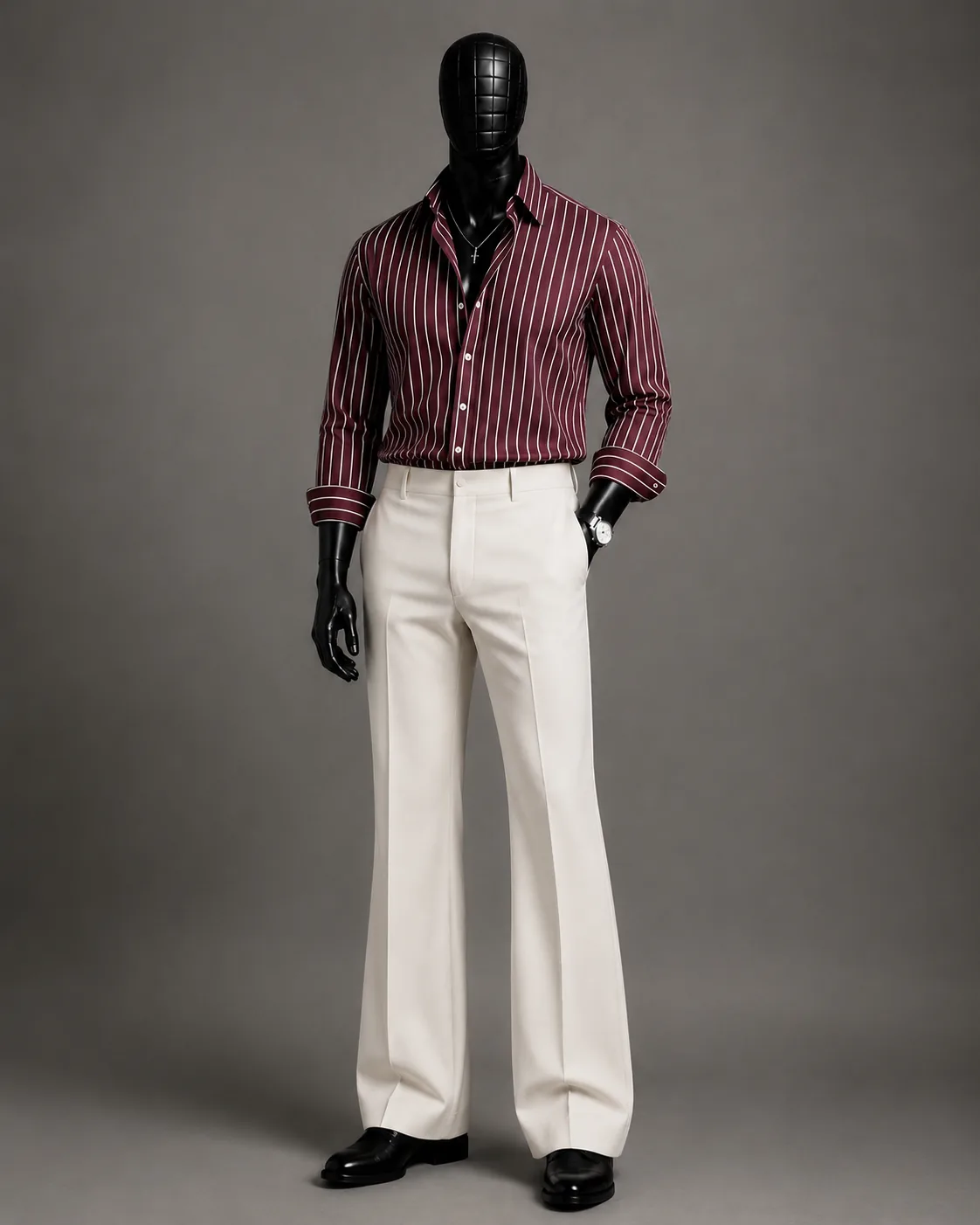
The stripe is doing more work than the colour. A flat maroon shirt against cream is a block of dark on a block of light — pleasant, but static. Add a fine pinstripe and the shirt now contains the trouser colour inside itself, so the two halves reference each other. The eye reads one designed outfit rather than a dark top and a light bottom that happened to meet.
Which is why the stripe's colour matters more than its width. It should sit close to the trouser — cream or bone. A bright white stripe gives a small mismatch that is hard to name and easy to see.
Go deep on the maroon. A true burgundy or oxblood anchors the cream; a bright cherry red reads sporty and fights it. Black leather at the floor, not brown — maroon and brown are both warm and together they muddy.
Paired with cream, maroon stops being festive-only — a strong Diwali outfit if you want to skip a kurta and still look like you dressed for it.
8. Yellow striped shirt with cream trousers
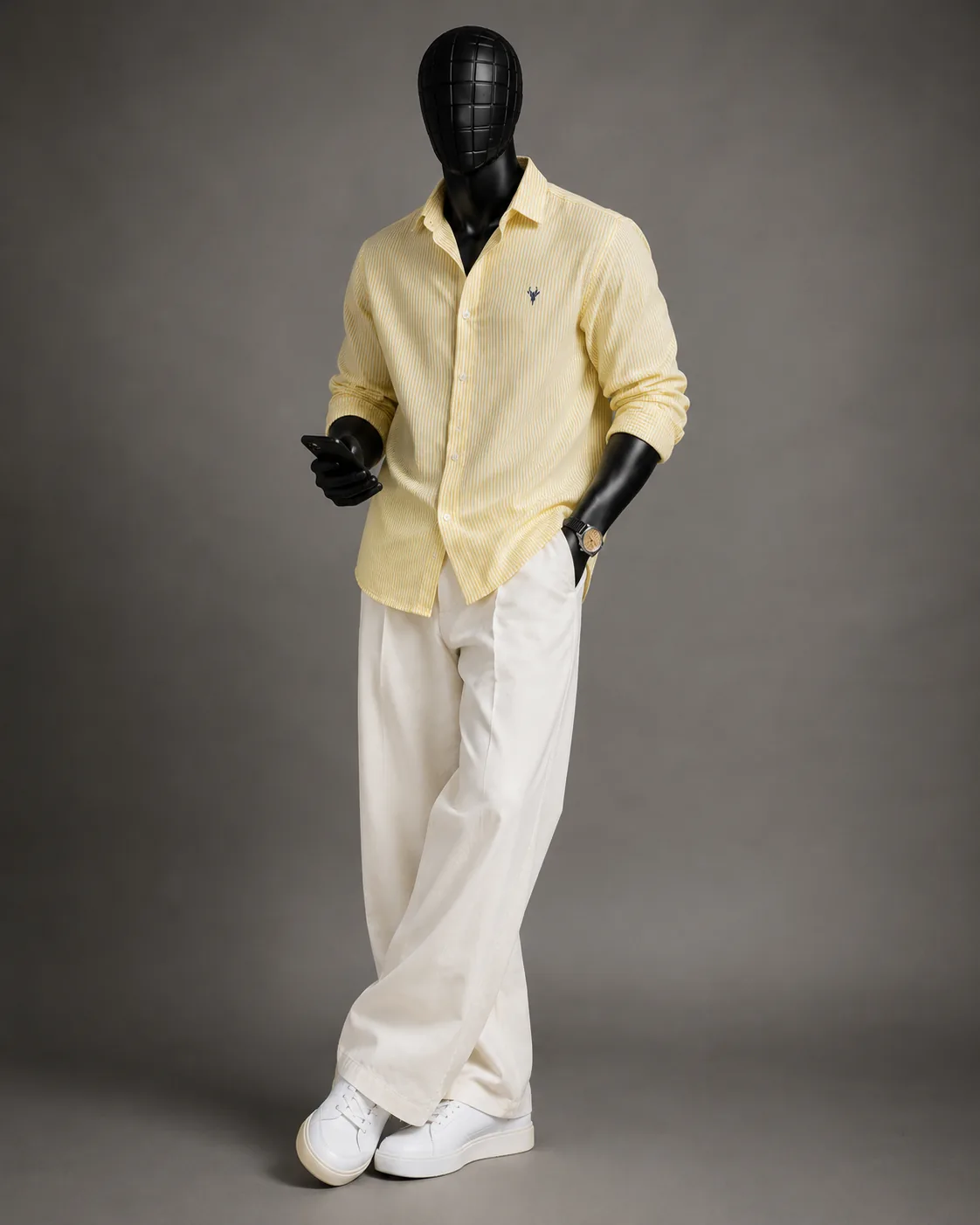
Yellow and cream are neighbours — cream is essentially a very desaturated yellow — so this is analogous pairing, the least risky kind. It is why the outfit feels calm rather than loud.
Here the stripe does the opposite job to the maroon one. There it imported the trouser colour into a contrasting shirt. Here it breaks up an analogous wash: a solid pale yellow can read soft, almost boyish, and fine white lines add structure so the colour stops sitting as one flat sheet. Keep the stripe narrow; a wide or coloured one turns this into a holiday shirt.
Pale, warm, muted — butter, wheat, soft sand. The test: if it looks bright indoors, it will look fluorescent in Indian daylight.
White sneakers keep it light; brown leather dresses it up. Black is the one to avoid, too hard a stop under something this soft. This is the most relaxed of the eight, and the one where an untucked hem is genuinely acceptable — provided it stops at your hip bone.
When to invert it: dark at the floor
Seven of these put the pale mass at the bottom. The eye lands on the shirt, the darker and denser half of the outfit, and everything below the waist reads as secondary. It is why the shirt is the decision here.
Invert it and the weight moves. Dark trousers hold the floor, so the eye stops lower and travels up — and in a dim room a pale shirt near your face is the brightest thing there. In warm restaurant light it pulls attention to your face rather than your chest.
The trade: a dark bottom half stops the vertical at the ankle, so the outfit reads more solid, more formal, less long. A fair price at an evening function, the wrong one on a hot afternoon.
Cream, off-white or stark white
Three trousers get sold as the same thing and behave differently, which is why look one changes the trouser rather than pretending otherwise.
Cream is warm. It carries yellow, so it sits near skin tone and near every warm shirt here. The join at your waist stays soft under a maroon or a butter yellow because there is no temperature jump to notice.
Stark white is cool and has no give. Under a warm dark shirt it cuts a hard horizontal at the waist. That is the usual advice, and it is correct as far as it goes.
It stops being correct under a cool shirt. Navy, cool grey and pure white all sit on the same side of the wheel as a stark white trouser, so the break looks intended. Off-white sits between the two and is the safest single pair to own.
Which of these suits your skin tone
Cream is warm, so it is already on the side of most Indian colouring before you add a shirt. What changes is how much of that warmth the shirt agrees with.
Wheatish: the warm shirts are the easy wins — chocolate, maroon, butter yellow and dusty rose share your undertone, so they sit with your colouring rather than arguing with it. Cool icy pastels can leave warm-undertoned skin looking drained; hold them up in daylight first.
Deeper: you have the most range here. A pure white shirt reads strongly because the shade gap rule four asks for is doubled by your own contrast. Watch the pale yellow, which can sit close enough in value to the trouser to go soft.
Fairer: try the inversion first. A pale shirt against fair skin can wash out; moving the dark mass down gives contrast without putting it next to your face.
Indian daylight versus indoor bulbs
You will read that maroon deepens in evening light while navy goes grey, and elsewhere that pale yellow dies under bulbs. Both describe one mechanism badly.
Warm indoor lighting adds yellow to everything it lands on. It pushes pale warm shades closer to a cream trouser, shrinking the gap rule four depends on, and pushes cool shades toward grey, because you are lighting a blue-leaning fabric with an orange-leaning source.
So it is not a ranking of colours, it is saturation. A butter yellow or warm ivory has little pigment to defend itself and drifts toward the trouser; a burgundy or chocolate has plenty and holds. Navy holds too, provided it is a true ink navy.
At 2pm the pale four — yellow stripe, pink, white, ivory — are at their best, where a stark white can blow out. Under bulbs at 9pm, the maroon, chocolate and black polo still look like the shade you bought.
Shop the constants
A shoe and a watch repeat across the eight, and both are linked below. The trouser is not, on purpose.
The trouser to look for: cream, ecru or bone cotton, with front pleats, a high rise and a wide leg — rules one and two depend on all three. The Amazon India listing we checked for this page, Amazon's own Symbol chino, is listed as a flat-front, mid-rise, straight-leg regular fit in a colour Amazon calls Beige. That is a different garment from the one in these images, so we have not linked it.
Black leather slip-ons (Bata Boss-Slick)
The dark stop at the floor that looks two, four, five and seven want. Leather upper, rubber sole, per the listing.
₹549
View price ↗Casio Vintage A158WA-1Q
Grey dial, silver steel bracelet, slim case — no colour of its own, which is what rule five asks for.
₹1,894
View price ↗As an affiliate we may earn a small commission from purchases made through these links, at no extra cost to you. It never changes what we recommend. Prices checked on Amazon India on 10 September 2026 — check the live price before buying. The shirts below are styling notes rather than product links: colour and stripe vary constantly in stock, so we describe what to look for instead of pointing at a listing that may not match.
- Navy: deep ink navy, matte cotton, no sheen.
- Chocolate brown: coffee-dark, never tan. Cotton, not polyester.
- Pink shirt: dusty rose, old rose or clay — not baby or bubblegum.
- Cream or ivory: warm ivory in cotton; against a white sheet it should read yellow.
- White: pure cool white, poplin or oxford, opaque enough to hide a vest.
- Black polo: ribbed or fine-gauge knit, true black. Pique jersey ruins it.
- Maroon stripe: burgundy ground, fine stripe in cream rather than bright white.
- Yellow stripe: butter or wheat ground, white stripe under two millimetres.
The mistakes worth naming
The first two are places where the usual advice contradicts itself, so the reasoning matters more than the verdict.
Untucking because the shirt feels casual. Formality is the wrong variable. The rule belongs to the trouser: a pleated high-rise wide leg needs the waist visible whatever sits above it.
Matching the shoe to the trouser. You will read that cream demands black, and elsewhere that black is too harsh for cream. Both answer for the trouser, which stays cream through six of these eight looks and so cannot decide anything.
Buying linen for a tonal pairing. Sensible in heat, wrong for looks four and five. Linen creases into shadows that blur the boundary between shirt and trouser, and a tonal outfit has nothing left once it goes.
A stripe brighter than the trouser. A bright white line on a maroon or yellow shirt over cream is a near-miss the eye keeps returning to.
Treating cream as summer-only. Cream is a colour, not a weight. The same shade in a heavier twill carries a chocolate shirt through winter.