← AI prompts · Poster
Romantic poster portrait — editorial collage AI prompt
A warm, dreamy collage-poster — floral saree, roses and butterflies, and your name in big display type behind the subject. That word behind is doing most of the work: this is a layout brief as much as a portrait brief. The full prompt is below.
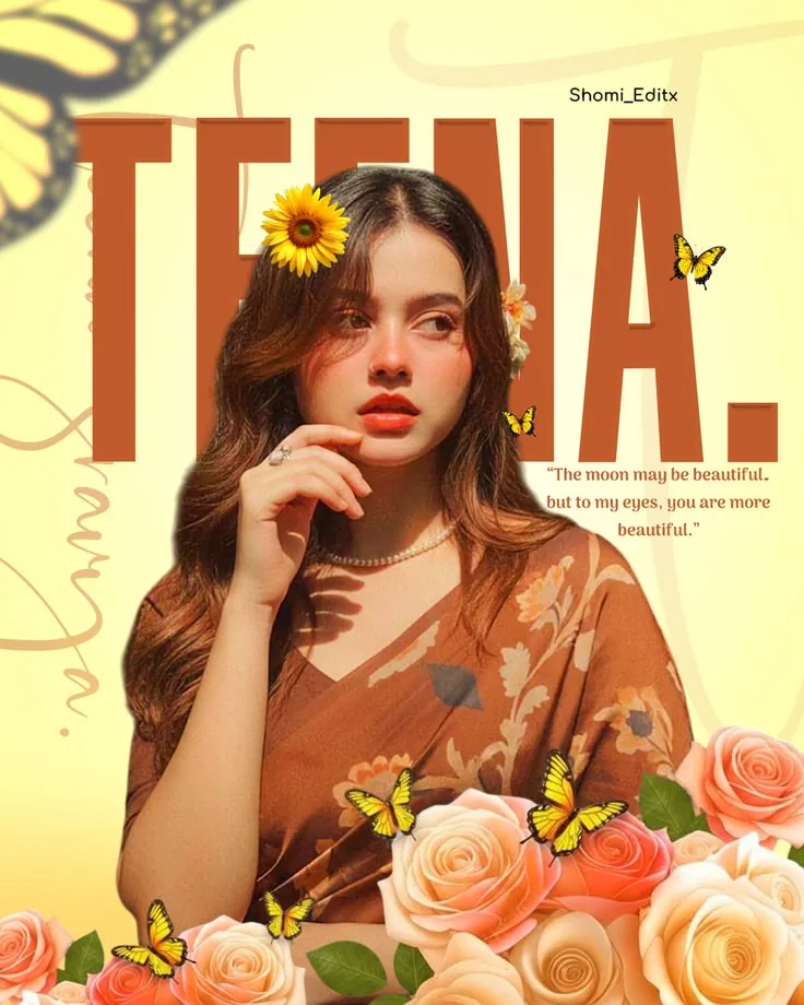
The one line that decides this: The subject should overlap the large background title text. It is the only clause that sets a depth order — type at the back, you in the middle, roses and butterflies in front.
The lettering is the riskiest thing in the frame — read the three ways this goes wrong before you send it to anybody.
About this prompt
Most prompts here describe a photograph. This one describes a page: around the face it specifies a title block, a quote, a cropped butterfly wing, a scatter of small butterflies, a rose foreground, faint scribble lines and a column of script — seven graphic elements around one head in a 4:5 frame. It is a layout brief.
The clause carrying the most weight is short: The subject should overlap the large background title text. It is the only line that mentions depth, and depth is what separates a poster from a photo with a caption. The rest of the collage inherits that ordering — roses overlapping the lower body, the wing partially cropped at the corner. It works only if the crop makes room, which is why the negatives rule out close crop and full-body crop together.
The lighting is deliberately undramatic — gentle diffused light from the front-left, shadows soft and shallow — because the background is flat; a hard side light would leave the face sitting on the cream page like a solid object. The gaze is layout too: the eyes look off-camera toward frame-right, exactly where the quote sits.
Why these lines are in the prompt
- Include these accessories and no more, and later and no extra ones. Closed lists, because AI image tools have a well-known habit of enriching a scene that is already decorated. Add your own element inside a list, not after.
- Keep the period visible. Four words on a full stop — but the period is what turns a name into a title, and small punctuation goes first when a tool draws lettering.
- photorealistic yet softly beautified, then natural and recognisable, then plastic skin, waxy skin in the negatives. It asks for retouching and fences it in the same breath; keep one half without the other and you get a generic pretty face.
How to use it
- Tap Copy prompt, then paste it into a generator that takes reference images and follows a long description — Gemini, Nano Banana, or Midjourney with a character reference.
- Attach two to four photos, at least one with the head turned; this is a three-quarter view. None of ChatGPT, Gemini or Nano Banana has an identity-strength or beautify slider, so say it in words: keep my exact facial structure and skin texture.
- Replace [YOUR NAME] and delete the square brackets; left in, they get drawn.
- Generate at 4:5, then read every letter.
Three ways this goes wrong
The lettering comes out wrong. Three pieces of type here: an oversized name, a thirteen-word quote and a column of handwritten script. AI image tools have a well-known habit of producing letterforms that convince in a thumbnail and fall apart when read. Replace the quote sentence with Leave the right side of the frame clear of text, keeping empty cream background at shoulder level.
The collage swallows you. The failure is inflation: roses climbing over the chest and the hand, several butterflies becoming a dozen. Cluttered layout is in the negatives, but that is a judgement and a measurement holds better. Ask for exactly three small yellow butterflies, all above shoulder height, and roses rising no higher than the lower chest.
The raised hand falls apart. Six negative-prompt entries concern hands and wrists, more than any other feature. Constrain the position instead of piling on negatives: the raised hand must be entirely in frame, all five fingers visible and separated, and must not cross the lips or jaw.
Making it yours
- Square it. Build a vertical 4:5 composition becomes Build a square 1:1 composition. You lose the vertical stack of title, quote and roses, so cut them to a low single row. Wider than square breaks the layout outright.
- Menswear. Swap the wardrobe paragraph for an elegant warm brown silk kurta with a cream nehru jacket, the accessories for a single thin gold chain, drop the hair-flower sentences and change feminine to composed. The rest carries over.
- A different palette. The colour paragraph is a list, so it swaps whole — sage green, ivory, dusty blue, slate and oat, title in deep slate blue. Keep the title the darkest value or the letters stop reading.
- A date instead of the quote: a short line at shoulder level in a readable serif, reading 12 . 04 . 2019. Digits give a tool far less to get wrong.
- Drop the collage — delete the decorative collage details list and add Keep the background completely clean apart from the title text. Or go festive: marigolds for the roses.
The Ganpati invitation card prompt pushes the typography further still — a date, a time and a venue to typeset. The Ganpati saree portrait is the same traditional wardrobe without the poster layer — one frame, nothing typeset over it.
Then match the pose in the Pose Mirror, check which colours suit your skin tone, or browse more AI photo prompts.
Frequently asked questions.
How many reference photos should I upload, and what should they look like?
My name is long. Will it still fit in the title?
Can I put my name in Hindi or Devanagari?
Can I add a second person, like a partner or a friend?
Why does the prompt ask for a softly beautified face? Will that stop it looking like me?
Can I print this poster, or is it screen-only?
Before you generate
Rehearse the three-quarter turn.
Torso one way, head the other, eyes off camera. Worth knowing what it looks like on your own face.